Oltiva Energy
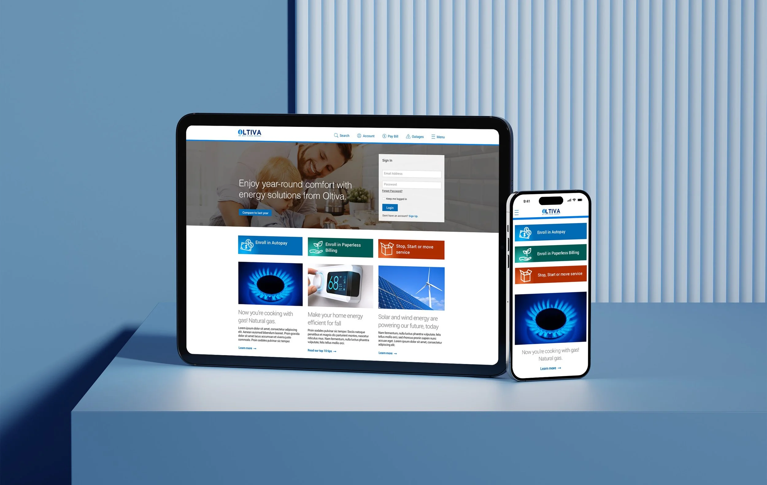
A utility company needed a complete overhaul of their digital presence to put the power (pun intended) back into their customer’s hands. This year-long project created easy-to-use online tools for more self-management and reduced costs.

Knowledge is power
Prototype designs were workshopped for usability and maximum understanding. I presented design findings to an oversight board that approved all project plans. Conducting design thinking sessions drives not only ideation and innovation, but brings consensus on implementation and ensures decisions are founded on a solid knowledge base.
Simple controls for complex tasks
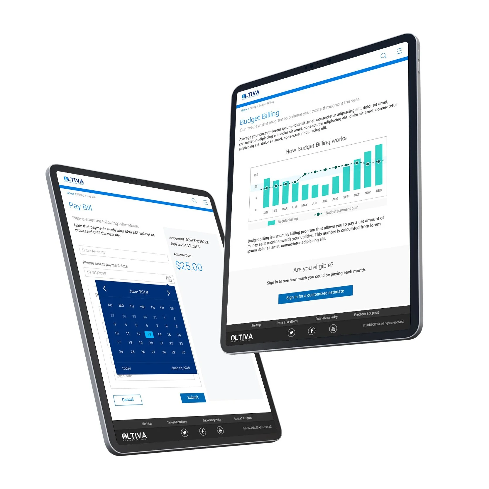
As this was a public utility, everything we designed and built had to be simple, intuitive, and accessible to the masses. We created user journey’s and task flows for all customer scenarios to track usage, manage and pay their bill, move location of service, and report outages.


The project goal was to build tools customers need to manage their home energy account – and reduce costly service center calls.

Mobility matters
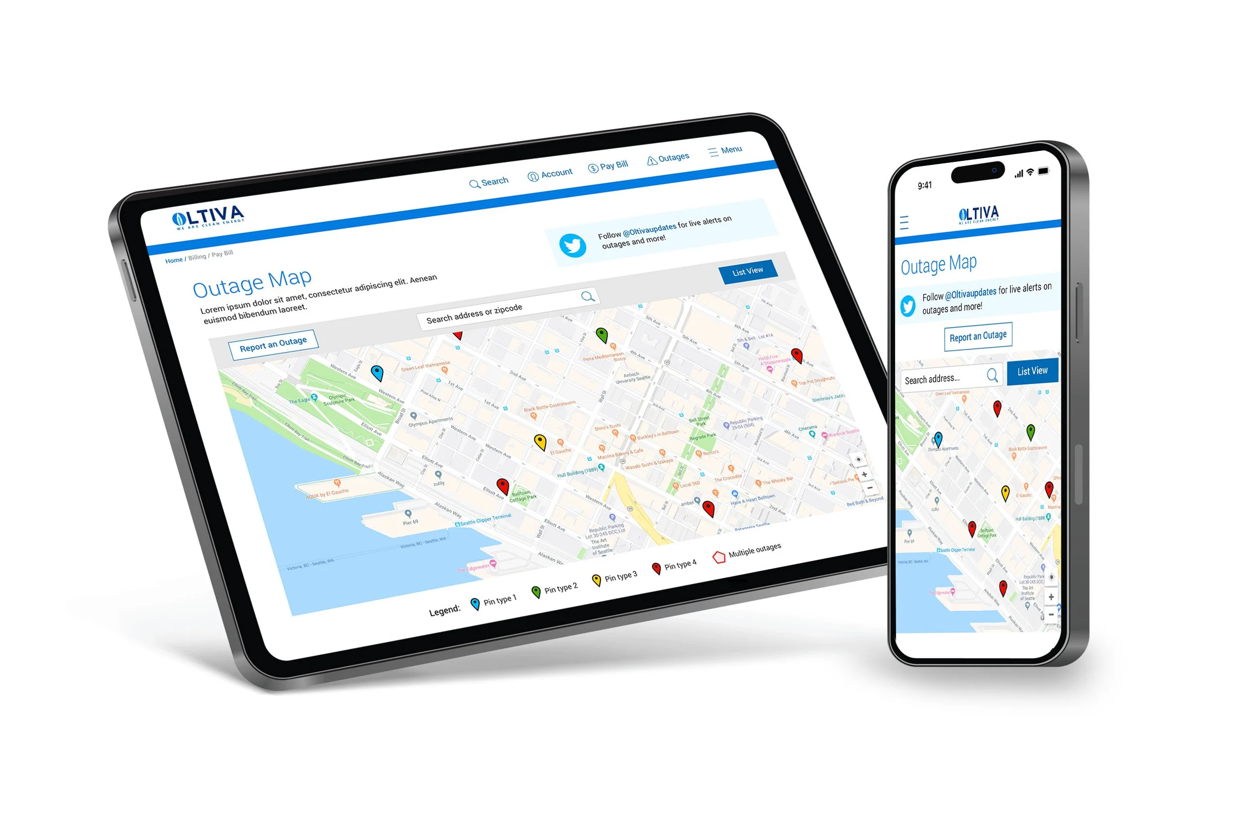
When the power goes out, mobile phone usage skyrockets as it is the only way to stay connected to information during a storm. Our mobile phone outage map had to be just as functional for reporting and tracking incidents as the desktop version. Screen size, touch targets, and pinch and zoom interactions all had to be carefully considered.

Data on-demand
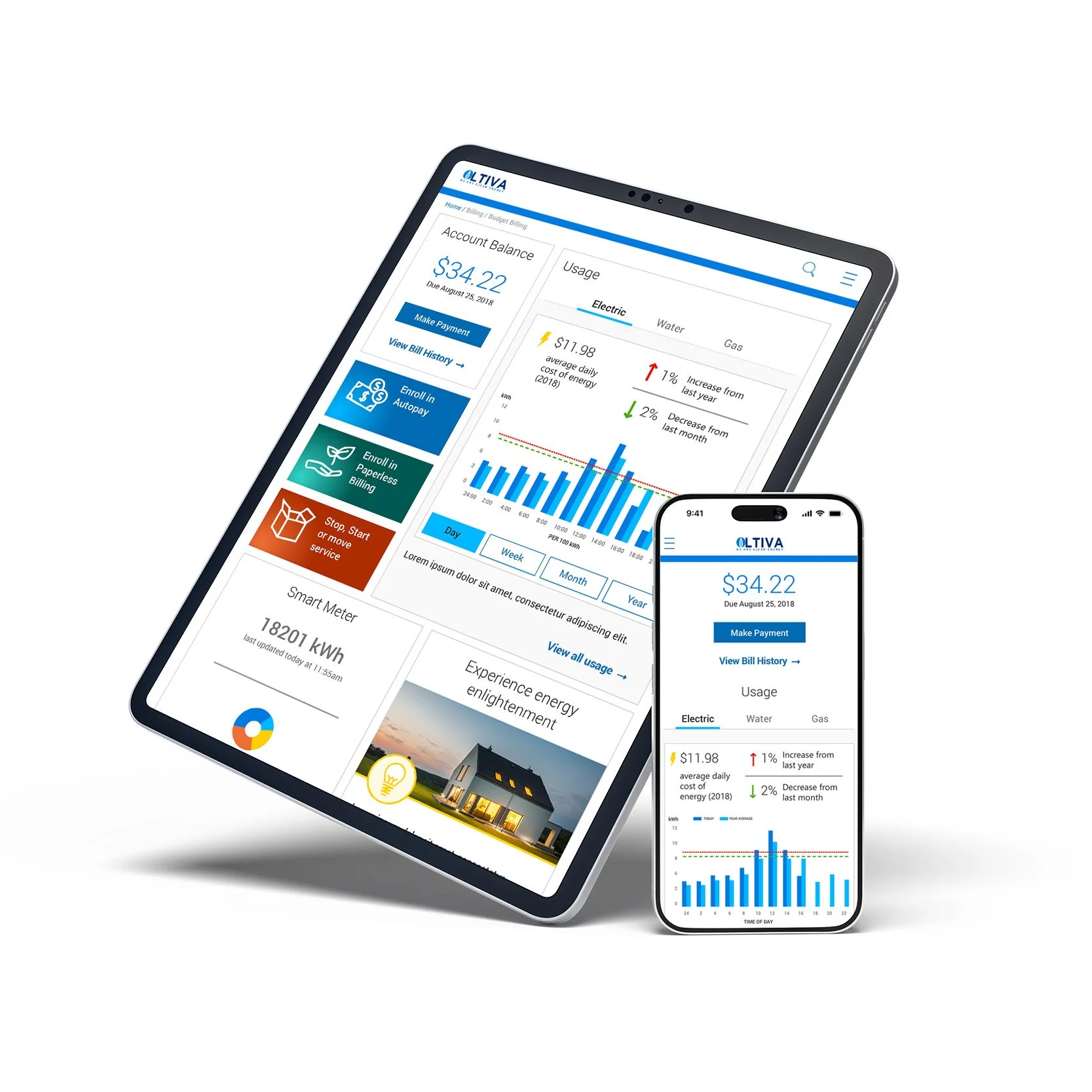
The wireframes and design of the customer dashboard needed to be more than just digital version of the bill. It needed to prioritize current (pun intended) usage against historical data and charts. Interactive modules that highlighted separate services and customizable time periods provided each household with a clear and understandable picture of their energy consumption. This newfound access to information ushered in an era of user self-service and decreased customer service calls overall.
